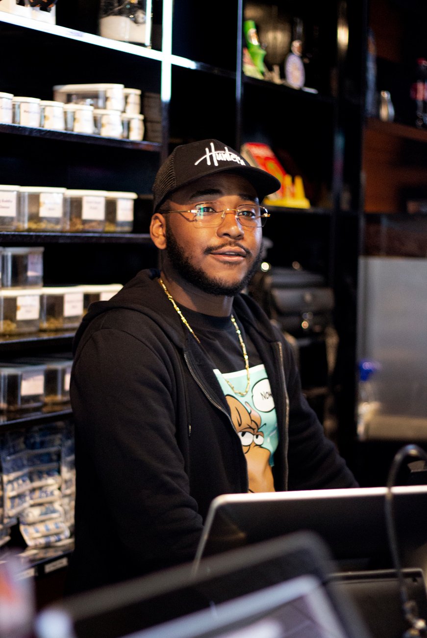

Hunter’s Coffeeshops
Founded in 1985, Hunter’s is one of the largest chains of marijuana dispenseries (locally known as Coffeeshops) in the Netherlands. They have 4 locations in Amsterdam, plus a location in Haarlem and another in the beachside town of Zandvoort. With 6 shops open from the early morning ‘til deep into the night, 365 days a year, they’ve built quite a loyal following over the past 35+ years.
Business was good, and they had no financial problems, but they felt their logo and graphics were a bit outdated and immature. Their logo (see below) was a rather complicated combination of text and a cartoon image of a dog, and much of their print material centered around comic-book-style imagery of the dog. The logo had heritage but was complicated to print, and didn’t come across as representative of a modern, professional business, which is the direction the company wanted to develop in. I worked with them to update their logo and design into an identity that would maintain their “street culture” vibe but also present them as a contemporary brand.
The new primary logo, based on graffiti-style handwriting, was designed to not only appeal to their core clientele (mid-level income urban men aged 18–30), but still look clean and professional to clients outside of that core demographic as well as other businesses with whom they might engage in partnerships. It was also important to design the logo in a single color. This allows it to be easily (and cost-efficiently) applied to any medium necessary, from silk screen prints to photocopies to glass engravings.
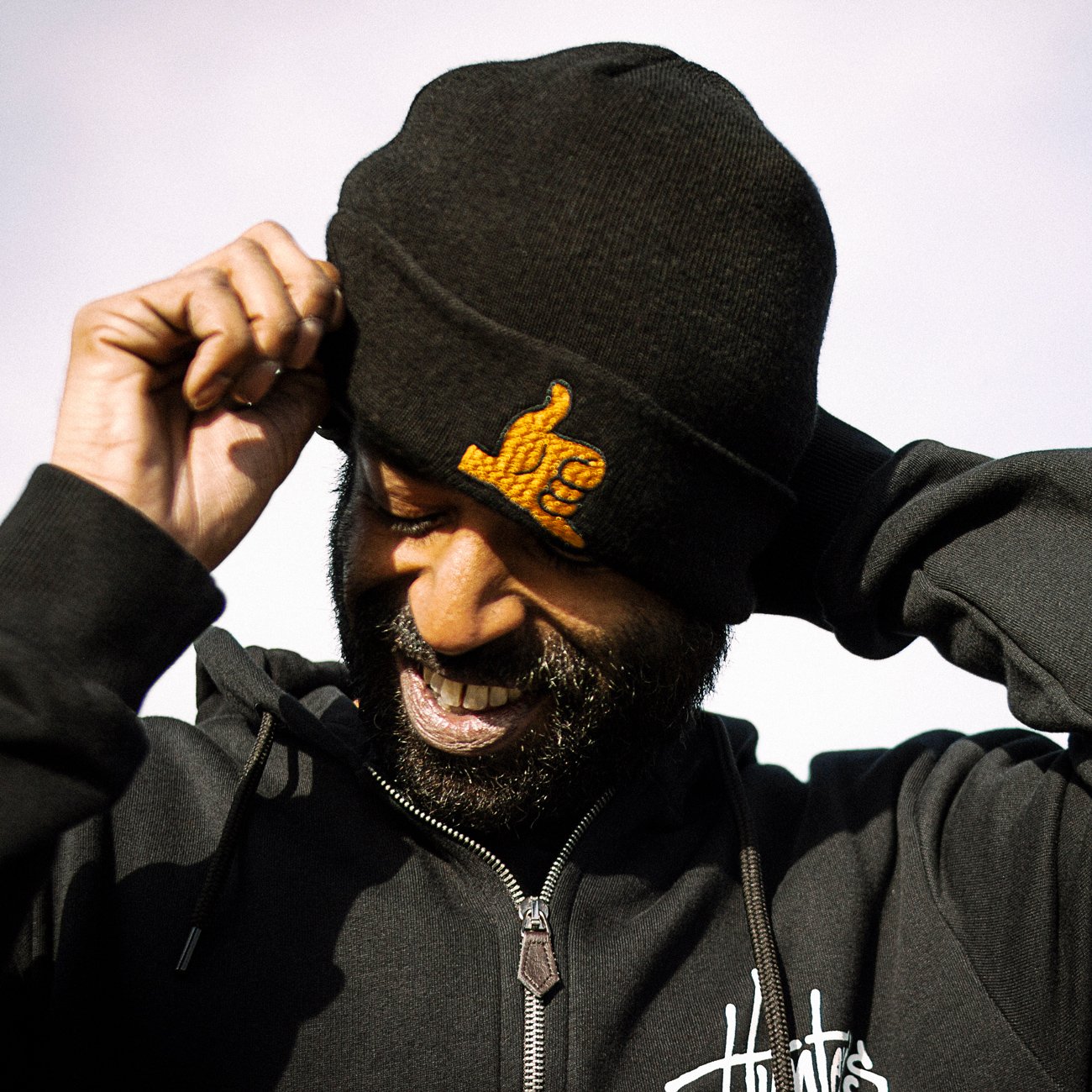
The old logo did have a pedigree and recognition that we both felt didn’t need to be discarded completely, so it was decided to keep it as a secondary logo and use it occasionally to maintain that connection to the past. Also, its colors were well known to customers, primarily purple, so those would be kept as well. This helped support a smooth transition from their old style into their new style. Being a purely visual update, since all products and methods of operation would remain the same, it was important not to shock or confuse their customers. In developing their refurbished brand identity, it was decided to keep the “chaka bra” hand sign (present in the original logo) as an icon on its own, dispense with the comic-book stylings altogether, and use various brand asset illustrations of the dog very sparingly (again, to maintain their heritage).


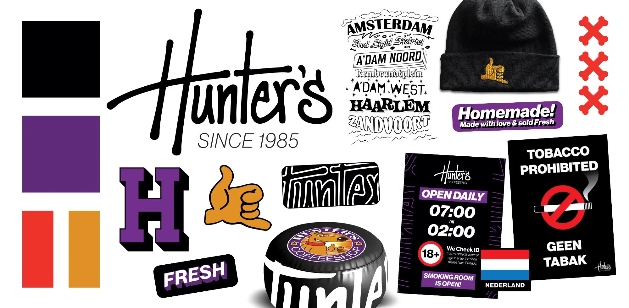
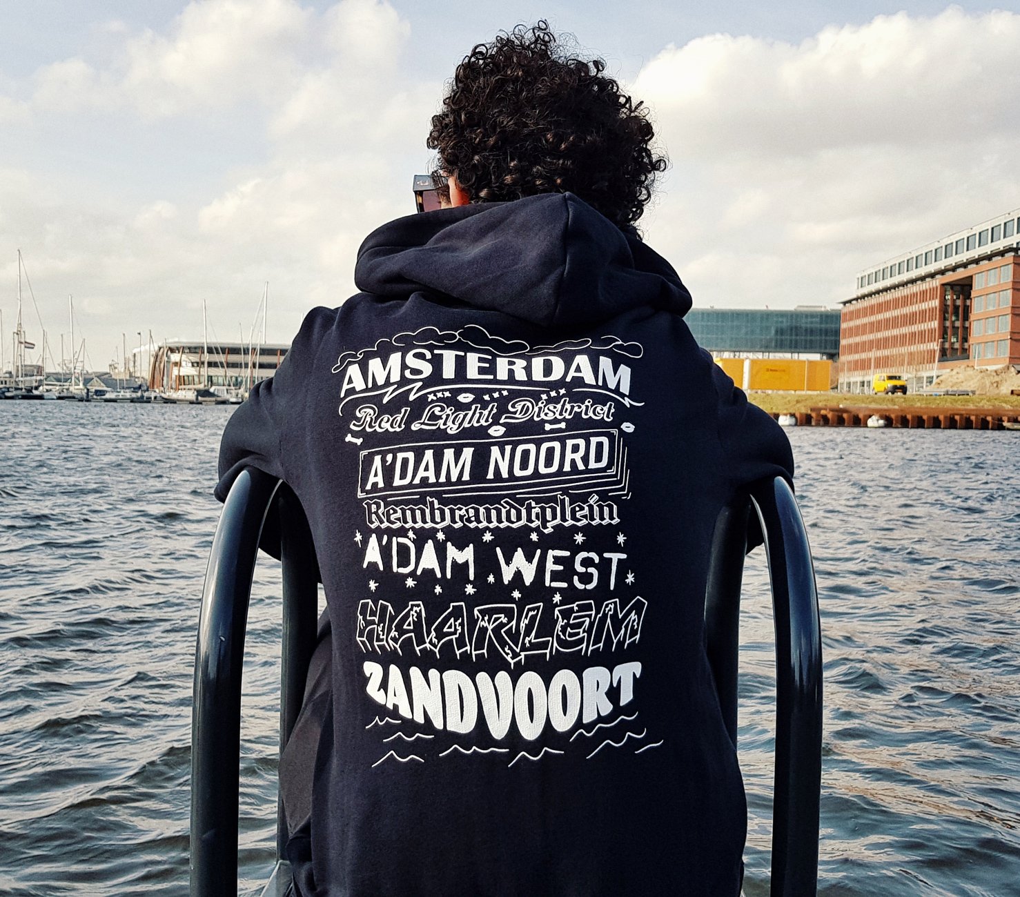
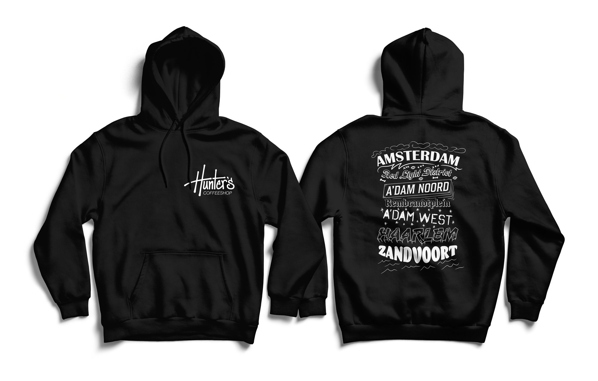
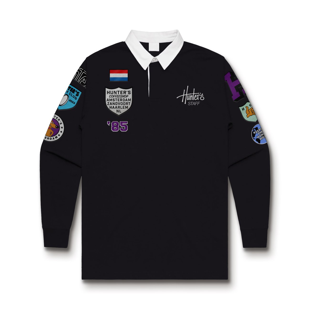
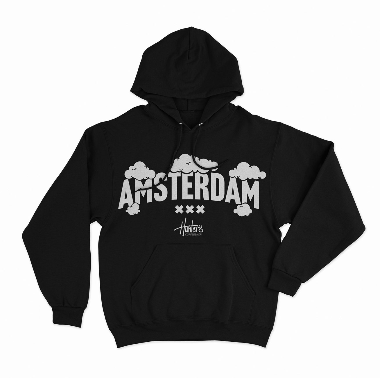
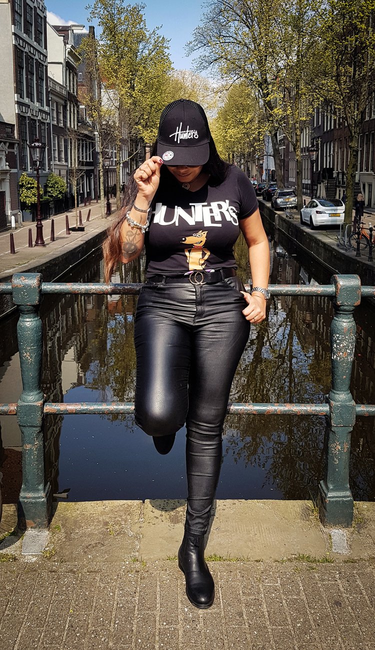
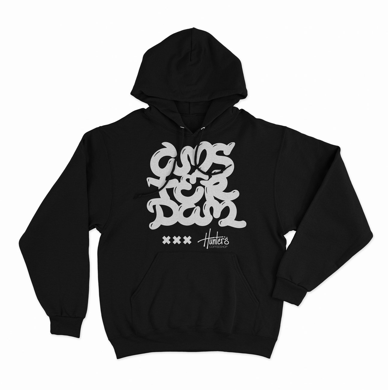
Various brand assets, merchandise, stickers, posters, & designs.
Printed materials are designed to have white text on a black background, with frequent use of purple accents and an occasional pop of red. The primary font for Hunter’s is Neue Haas Grotesk Display, chosen for its clean appearance, dynamic range of weights, and easy legibility. Also, it pairs nicely with the new script logo (and with the old one too, when used), plus it exudes a fresh, modern look. Instead of a true pattern, the script logo is outlined, enlarged in size, and then cropped to create a unique space filler that complements the brand designs without drawing attention away from the primary information.

Drinks menu for the Hunter’s Coffeeshop located in Rembrandtplein, Amsterdam.
Hunter’s merchandise follows the same guidelines as the print material: white print on black text, with the optional addition of supporting colors. Dutch law prohibits dispensaries/coffeeshops from making any direct references to marijuana or smoking (so no weed leaves, joints, or cannabis-related terms). As such, Hunter’s merchandise focuses on lettering and typography that work in conjunction with the script logo and maintain the local, street-style image of the brand while at the same time being appealing to tourist clients looking for a special souvenir from their visit to a Dutch coffeeshop.