Maarit Hänninen
After building a healthy following on Instagram with her folk art-influenced linocuts, artist and illustrator Maarit Hänninen launched a YouTube channel to showcase longer videos of her printmaking process. I came on board to develop titles and lettering that reflected and complimented the handmade aesthetic of her hand-carved linocut prints.
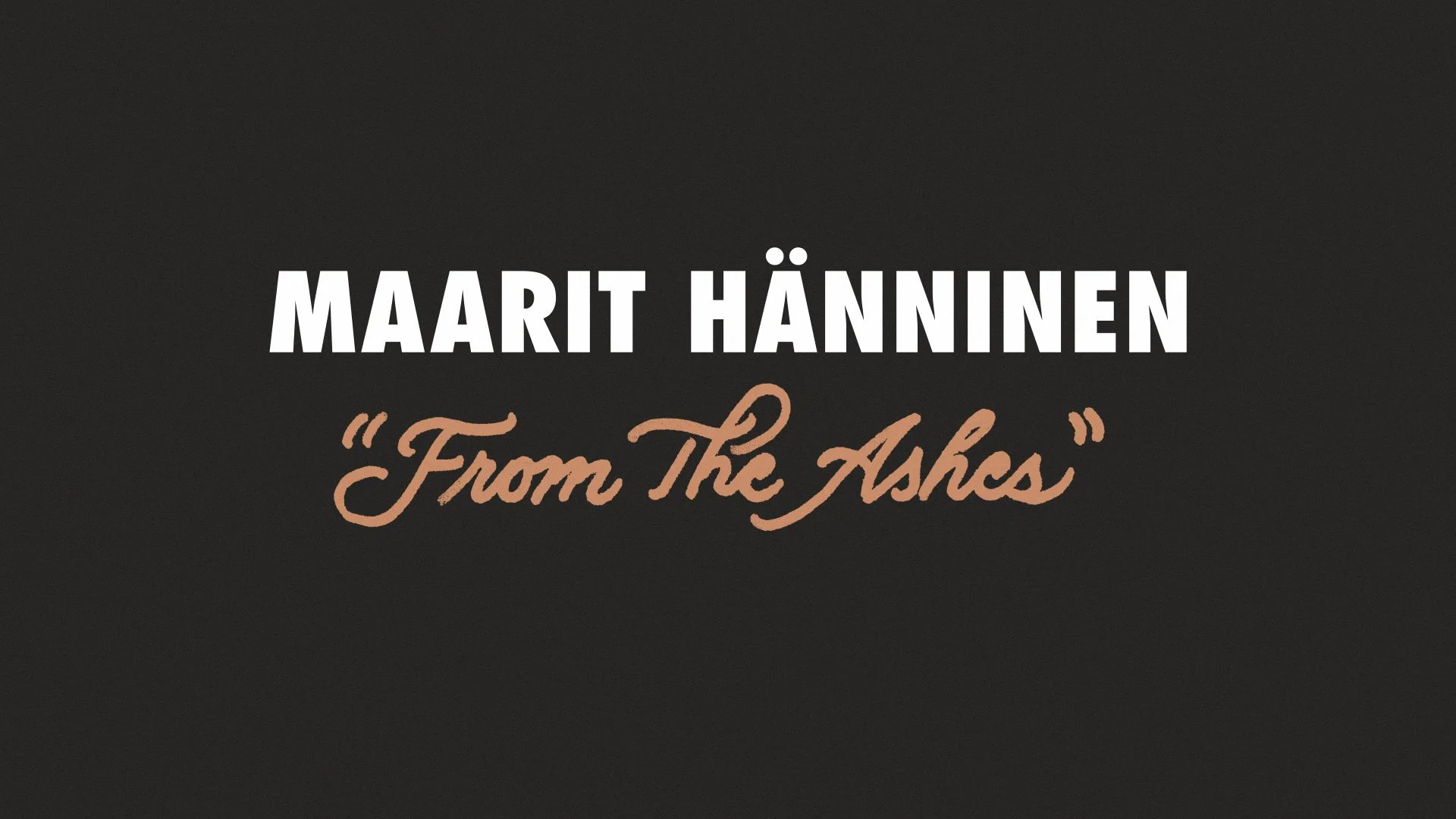
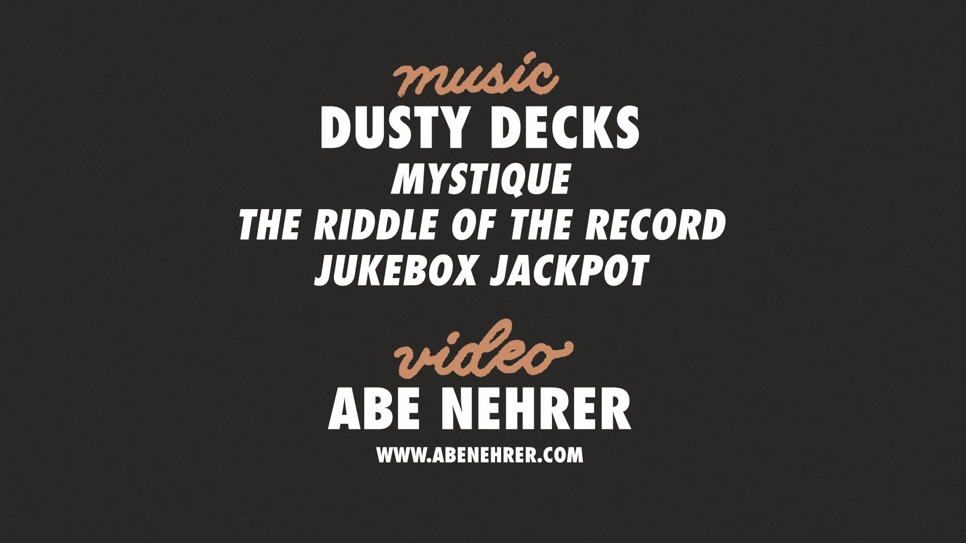
Title lettering for “From the Ashes” linocut process video. Click here to watch the full video.
Futura PT was chosen as the primary typeface. This classic typeface is, most importantly, clean and legible. Being featured in a video, its screen time is limited, and the need for quick reading was a top priority. Futura PT was crafted in Germany in the mid-1920s and carries a more classical feel than modern sans-serif typefaces. This parallels the client’s artwork, which is heavily influenced by folk art from the start of the last century.
In addition to the age of the typeface, it’s visibly more Northern European in nature (as opposed to Mediterranean, French, or American type of the same period). Again, this compliments Maarit’s personal style, which is heavily influenced by her native homeland of Finland and broader Nordic influences.
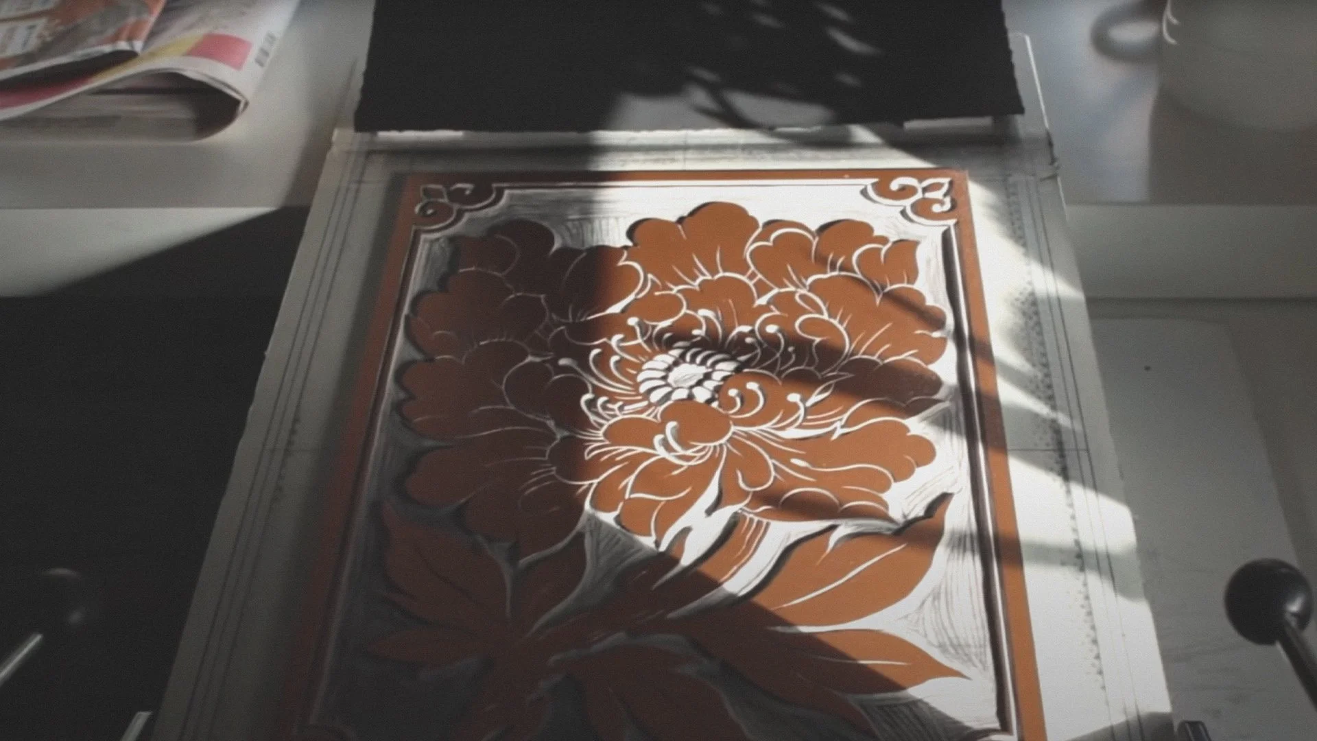
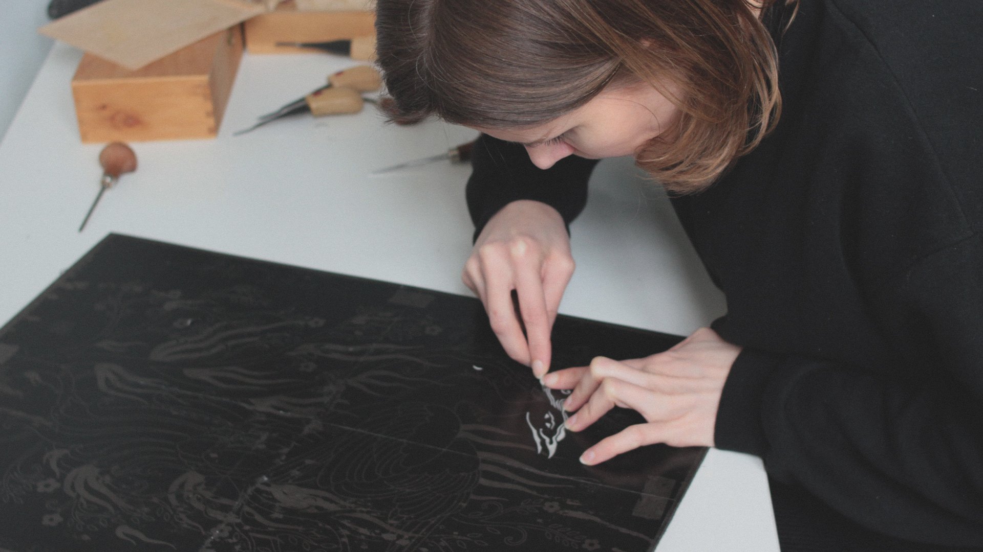
Still image from “Lush” Linocut Printmaking Process video. Click here to watch the full video.
All of Maarit Hännien’s work is hand sketched and then carved manually from blocks of linoleum or wood, so it contains slight imperfections and deviations that differentiate it from the robotic precision of vectors and laser cuts. These traits lead to the uniqueness of the works and afford them a humanistic and authentic quality that can only be achieved by hand. With this in mind, a handwritten, slightly roughened script was created to work alongside the primary typeface.
I used dip pens with round Speedball nibs and black Pelikan calligraphy ink to achieve the look I was aiming for. This approach resulted in uniform line widths with naturally textured edges, evoking the slightly rough edges of Maarit's carved and inked prints. The harmonious contrast between the script's curves and roughness and the primary typeface's crisp edges and clean lines further underscored the essence of her handcrafted artistry.
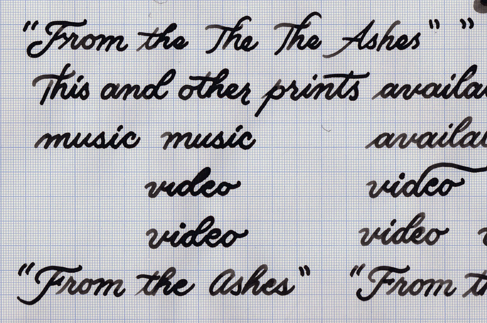
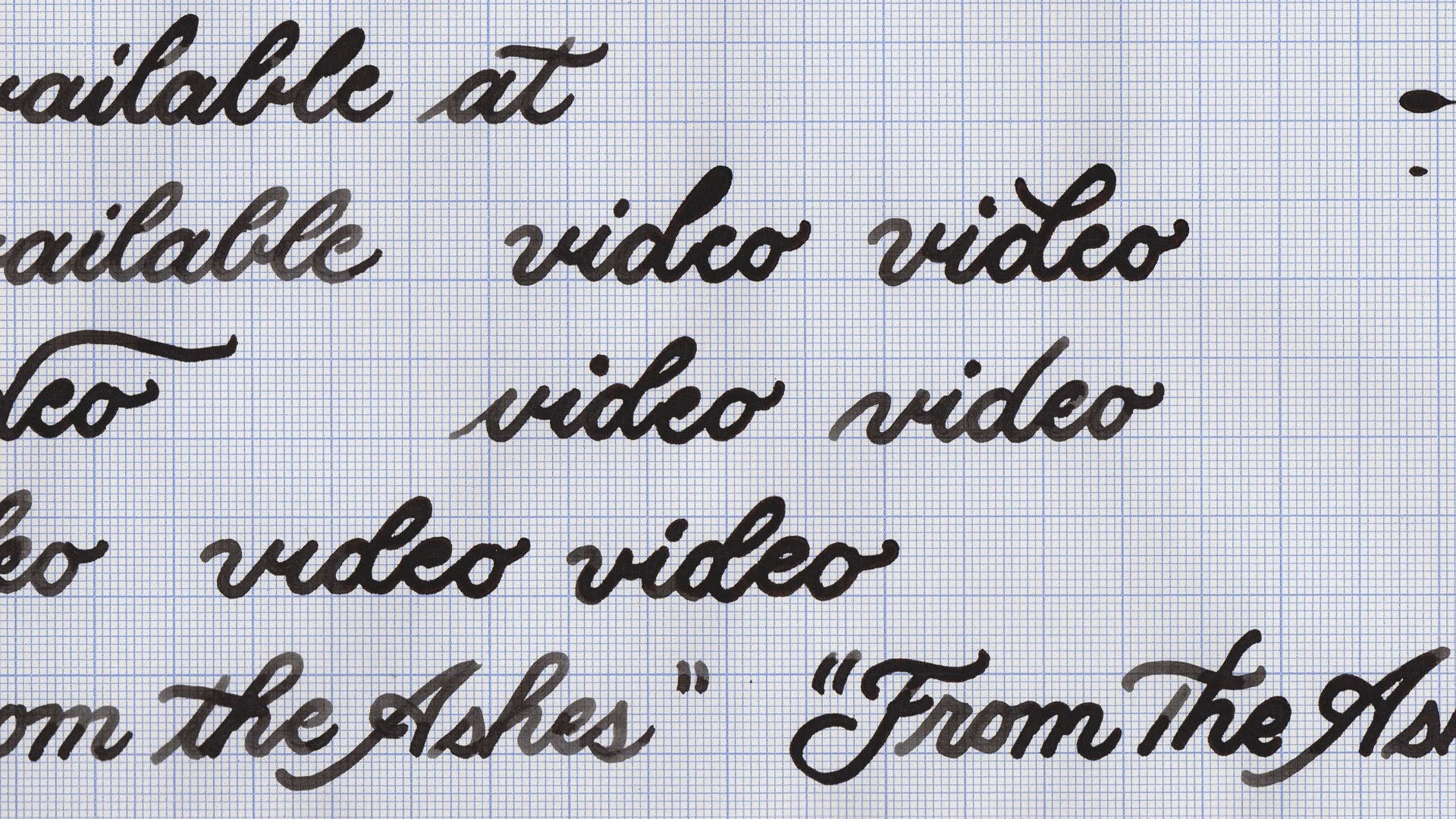
Scan of initial ink lettering for “From the Ashes” Linocut Printmaking Process video.
All words were written out numerous times after settling on the appropriate lettering style. Among the slight variations, the most uniform and legible ones were selected for final use. They were scanned and then adjusted within Photoshop to ensure a consistent opacity.
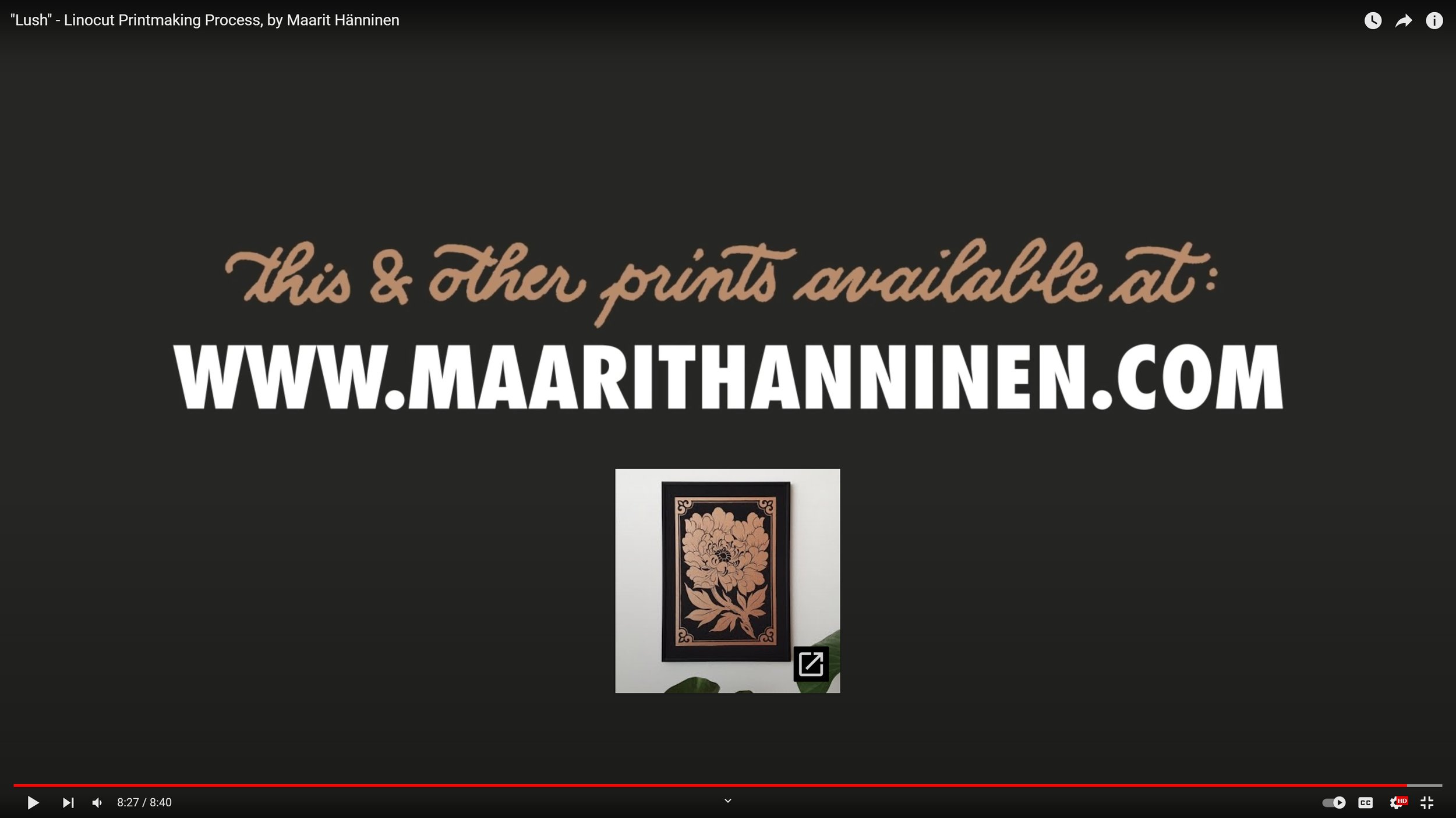
Screenshot from “Lush” Linocut Printmaking Process video, showing how it would look within the app itself. Click here to watch the full video.
Other than opacity, very minimal editing was done in Photoshop. It was important to retain the raw, handwritten look. Incorporating some color also helped set it apart from and direct focus toward the primary text. The selected colors matched the video’s palette and Maarit’s prints while also providing some visual contrast.
The final lettering and typography nicely complimented the handcrafted, folksy aesthetic of Maarit Hänninen’s work and provided viewers with an inviting and rapid reading experience. In addition to the typography, I also handled all the filming and editing of her videos, creating a tone and feeling that further reflected her art and personality. Being both unique and informative, over the course of the past few years the YouTube videos have over 1.5 million combined views, and helped position Maarit as one of today’s leading printmakers.