Paráis
Before launching their clothing line and brick-and-mortar shop, Spanish brand Paráis reached out to me to help craft their logo. They were looking for a logo that was clean and classic but also influenced by US street wear brands like Stüssy, Undefeated, and Supreme. To find that middle ground, I knew it had to be hand drawn, so I grabbed some ink and a variety of pens and nibs and began experimenting. My process for logo design always involves a deep exploration of the various possible looks; if something starts to look good, I create variations on that theme, and then I write something else and keep changing the styles.


For Paráis I created hundreds of ideas, from which I whittled them down to a handful that I felt showed true potential and matched the concepts and needs of the client. The images below show the first round of draft ideas presented to the client.
At this stage, I engaged in more dialogue with the client, in which we examined the strengths and weaknesses of the draft ideas. Some designs were deemed too rough, some too old-fashioned in tone, and some the client just didn’t have a strong gut reaction to. I naturally had my personal favorites as well. Through detailed discussion of the draft logos, the look that was desired became quite apparent (bottom row, 2nd from right): it had nice contrast in the letters, felt classy without looking like a luxury brand, looked smooth and deliberate instead of rough and rushed, and most importantly, the client loved it and I felt confidant about it as well.

Having reached a consensus on the best option, I got to work meticulously crafting the initial sketch into its refined final form. The scanned sketch got adjusted and worked on in Photoshop, then fully realized in vector format (a draft version is pictured below) using FontLab. Lots of analysis goes into this stage to see which adjustments (often very slight ones) need to be made and which look best. Various drafts are saved and compared, with the eventual choice being presented to the client as a final draft for any last bits of feedback.
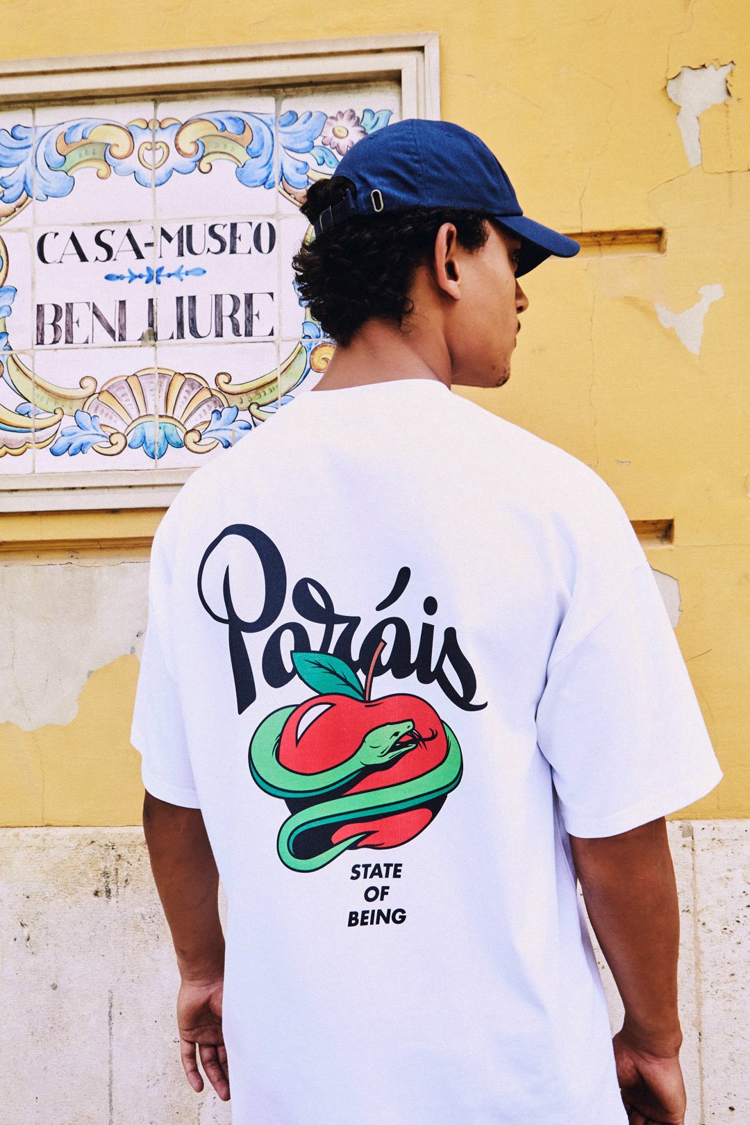
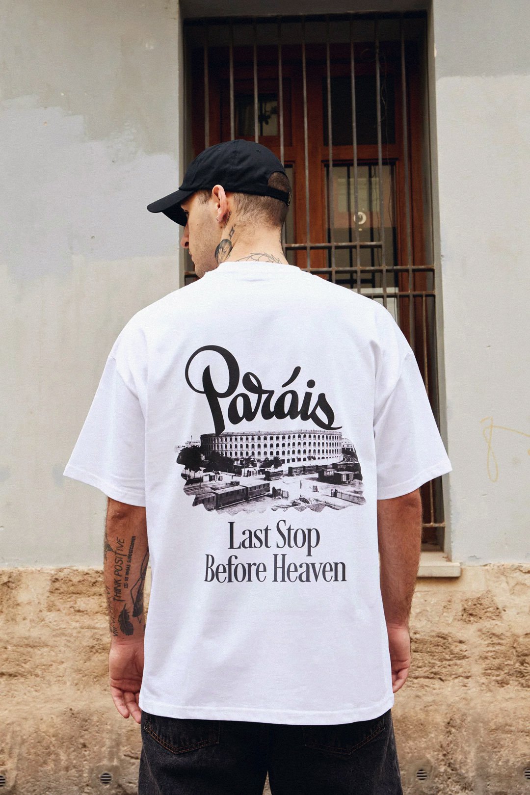
The end result is a great-looking logo that Paráis was extremely happy with, and we are both convinced it will represent their brand properly. They initially only wanted a logo, but our working relationship went so smoothly that I helped them further with various designs for shirts and hoodies. The logo itself was a big hit with customers as well, with numerous best-selling products featuring the logo alongside illustrations or even just the logo itself.